Radiun Art Musuem: Interactive Mobile Brochure
Enhancing free-roaming visitors' exhibition experience at a contemporary art museum in Delft.
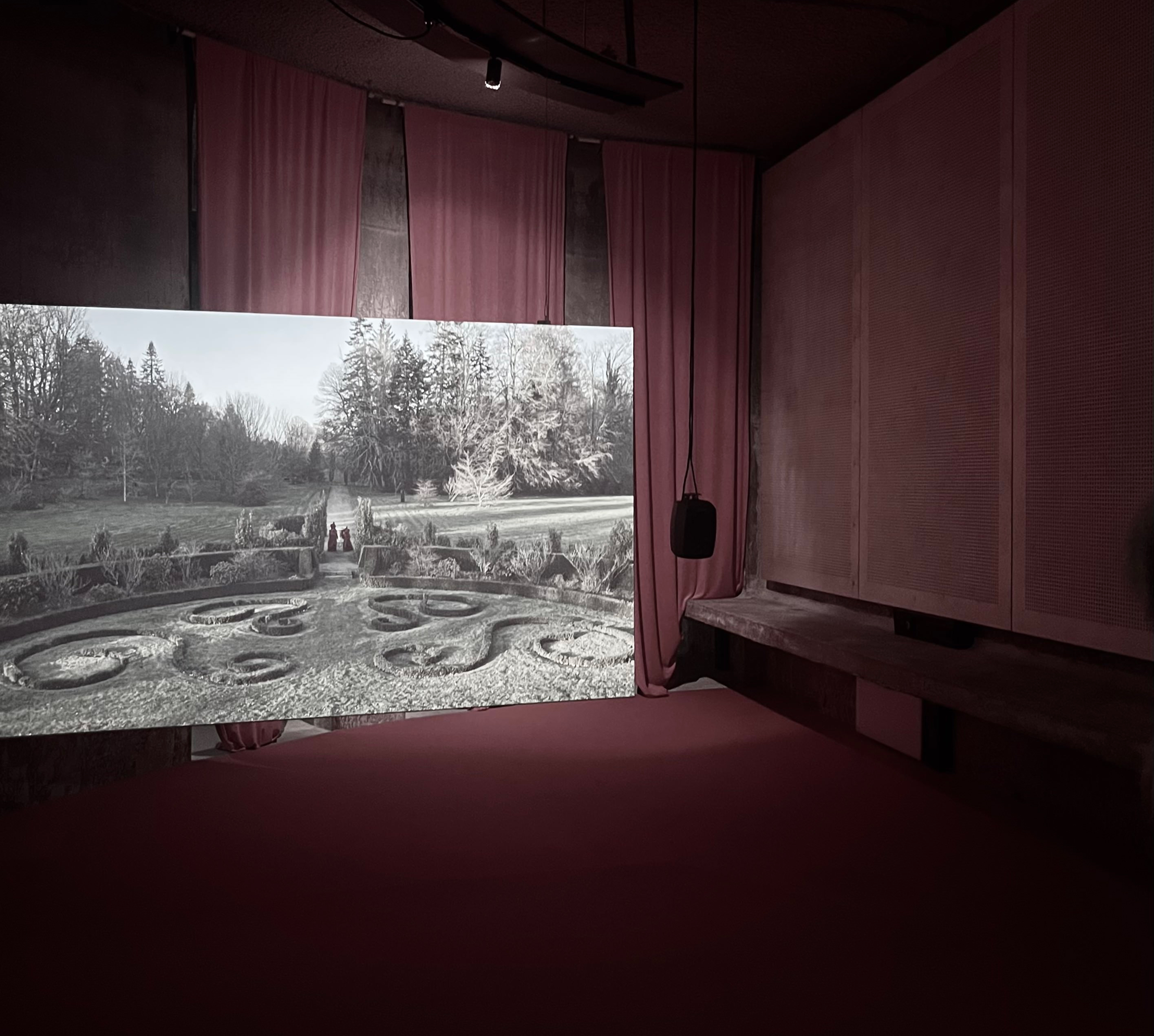
Radius, located in Delft, exhibits comtemporary artworks that mainly revolve around the intersectional theme of science, history and philosopy. Director reached out to my university looking for a creative and fresh design solutions, giving me the opportunity to lead a solo UX project.
& Designer
Background
As the museum is relatively new, it has been welcoming a growing number of visitors, including students and local residents. In response, the museum’s directors are actively exploring ways to improve audience satisfaction and ultimately increase conversion.
Problem
The staffs noticed that free-roaming visitors often times have trouble navigating the museum and understanding the complex artworks. To address this challenge, they were looking for an innovative approach to better guide these visitors through the museum.
Target Group
Visitors who explore the space independently, so-called free-roaming visitors, were identified as a key target group. Within this group, we placed special focus on those with little background in contemporary art or in themes like history and philosophy.
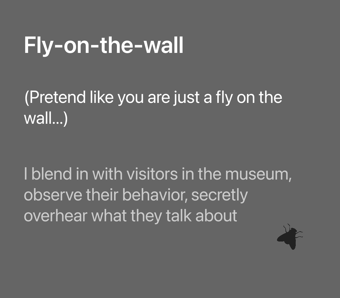
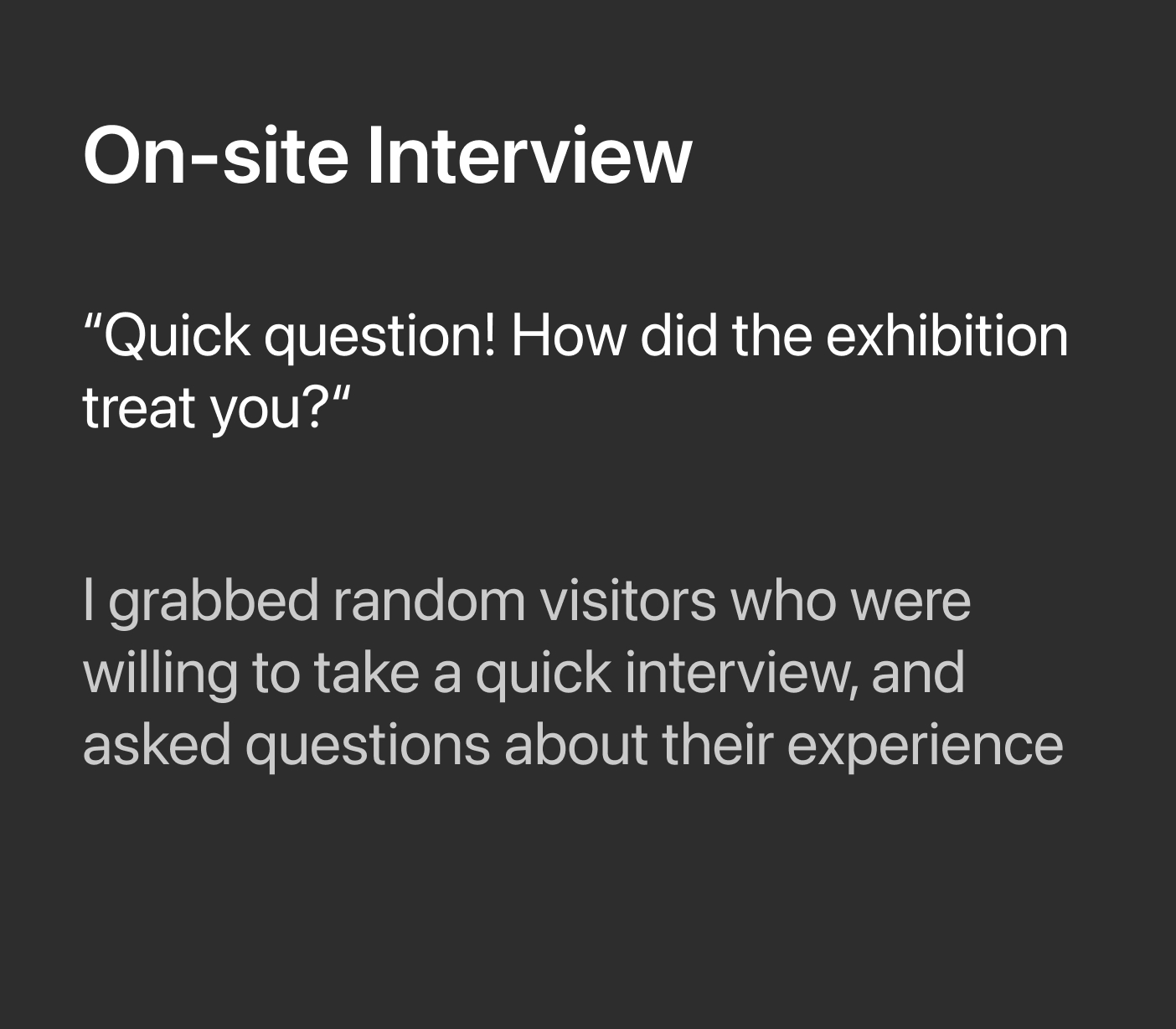
How I empathized with target audience
To truly see, feel, and listen to the real experience, I took a more hands-on and creative approach to research. I selected participants who matched the target group, from university students and highly motivated visitors to people I encountered directly on site. Below are the methodologies I used.
Key findings on how and why users struggle
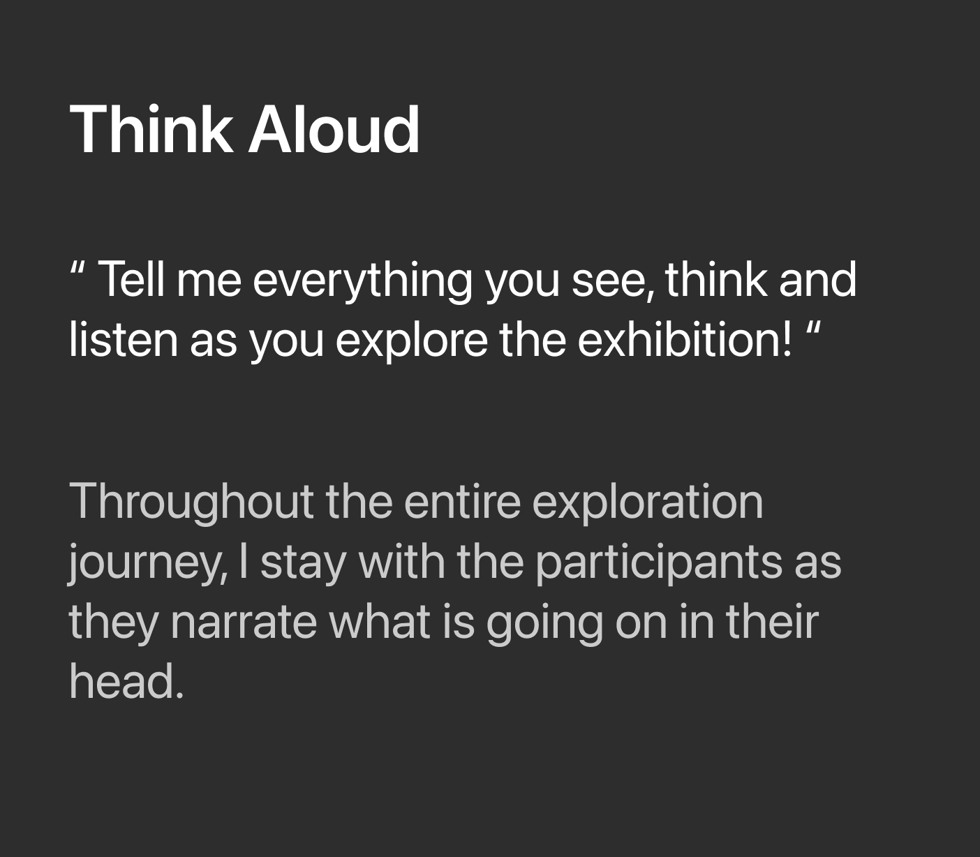
I conducted a full-day observation, held quick interviews with 12 museum visitors, and ran think-aloud sessions with 2 selected participants. Using affinity diagramming to synthesize the findings, I identified 4 primary insights.
Visitors rarely engage with the existing paper brochures. Like many other art museums, Radius provides a guide brochure at the entrance, yet throughout the research it became clear that most visitors either choose not to take one or, if they do, barely refer to it while viewing the artworks.
The existing brochure also created a sense of disconnection for free-roaming visitors. Its highly academic language and complex wording made it difficult for many of them to read and fully understand.
As a result of these challenges, many visitors became noticeably unmotivated halfway through the exhibition. Instead of engaging deeply, they wandered without clear direction and often left without the fulfilling experience they had expected.
Visitors in groups tend to engage more deeply by discussing and sharing their thoughts. They often spend more time with each artwork, observing and interacting more, suggesting that the experience is enhanced when shared with others
Ideation
By combining creative techniques such as behavioral design, brainstorming, and empathy mapping, I explored a wide range of ideas to help users overcome these challenges. From there, I refined them into a clear design direction that is efficient, engaging, and realistically feasible.
Final Design Concept
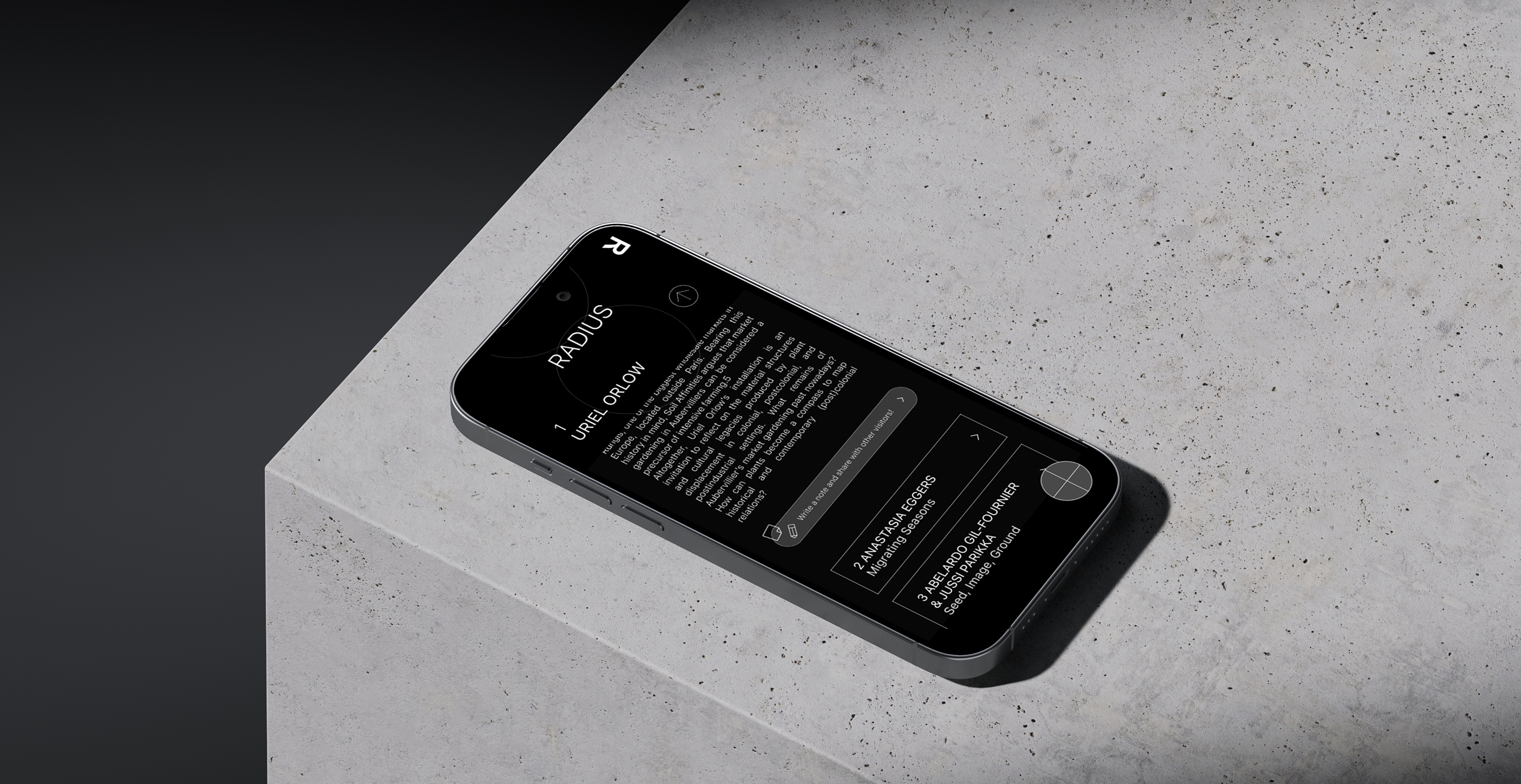
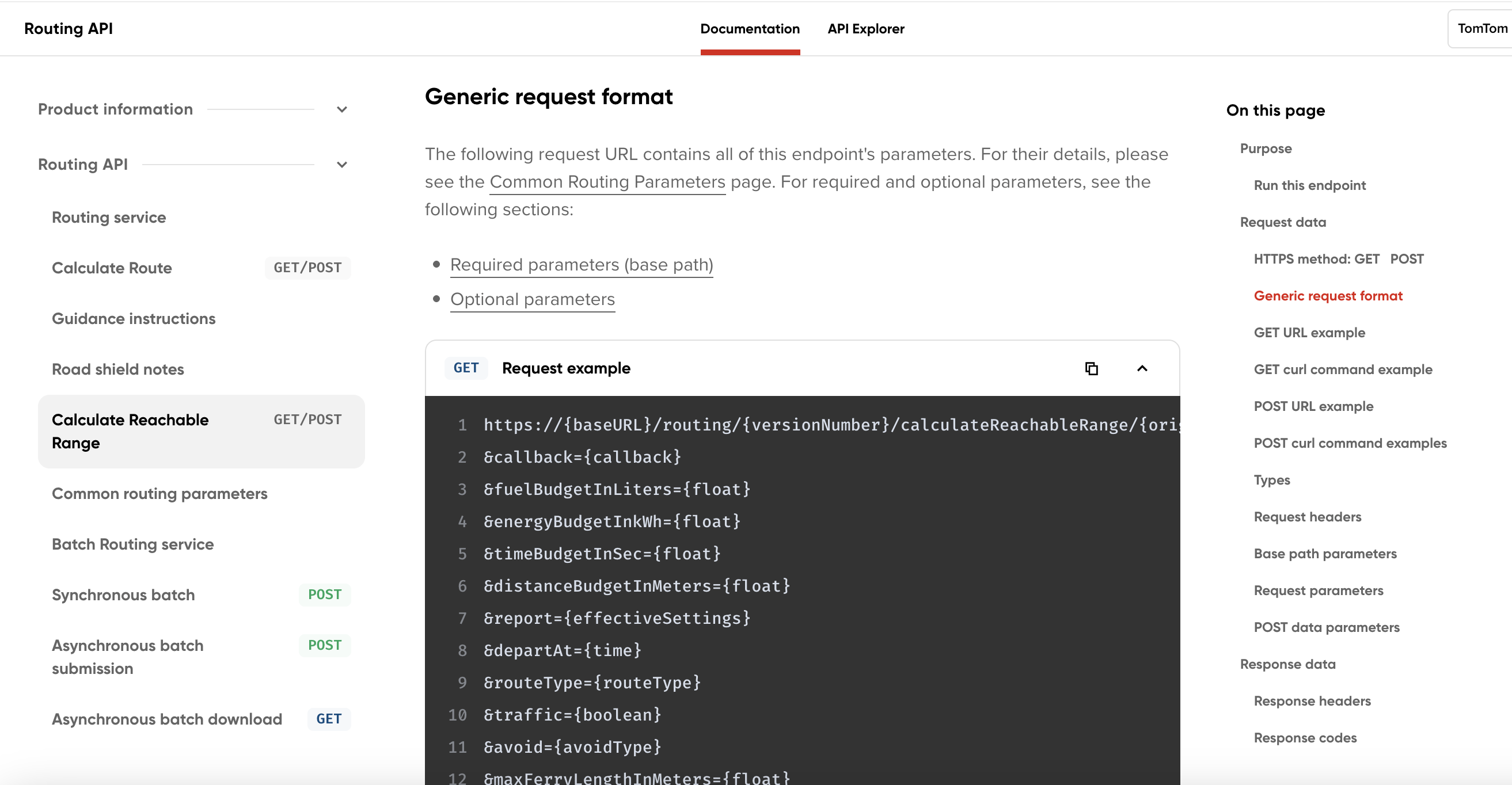
Why don't we create a mobile brochure that is accessible via the NFC ticket? It can spark curiosity and interest among free-roaming visitors naturally leading them to use the brochure. The feature includes multiple functionalities such as a dictionary, guidebook, map, and note-taking tool creating a more engaging and motivating experience. Almost like going on a small adventure through the exhibition!


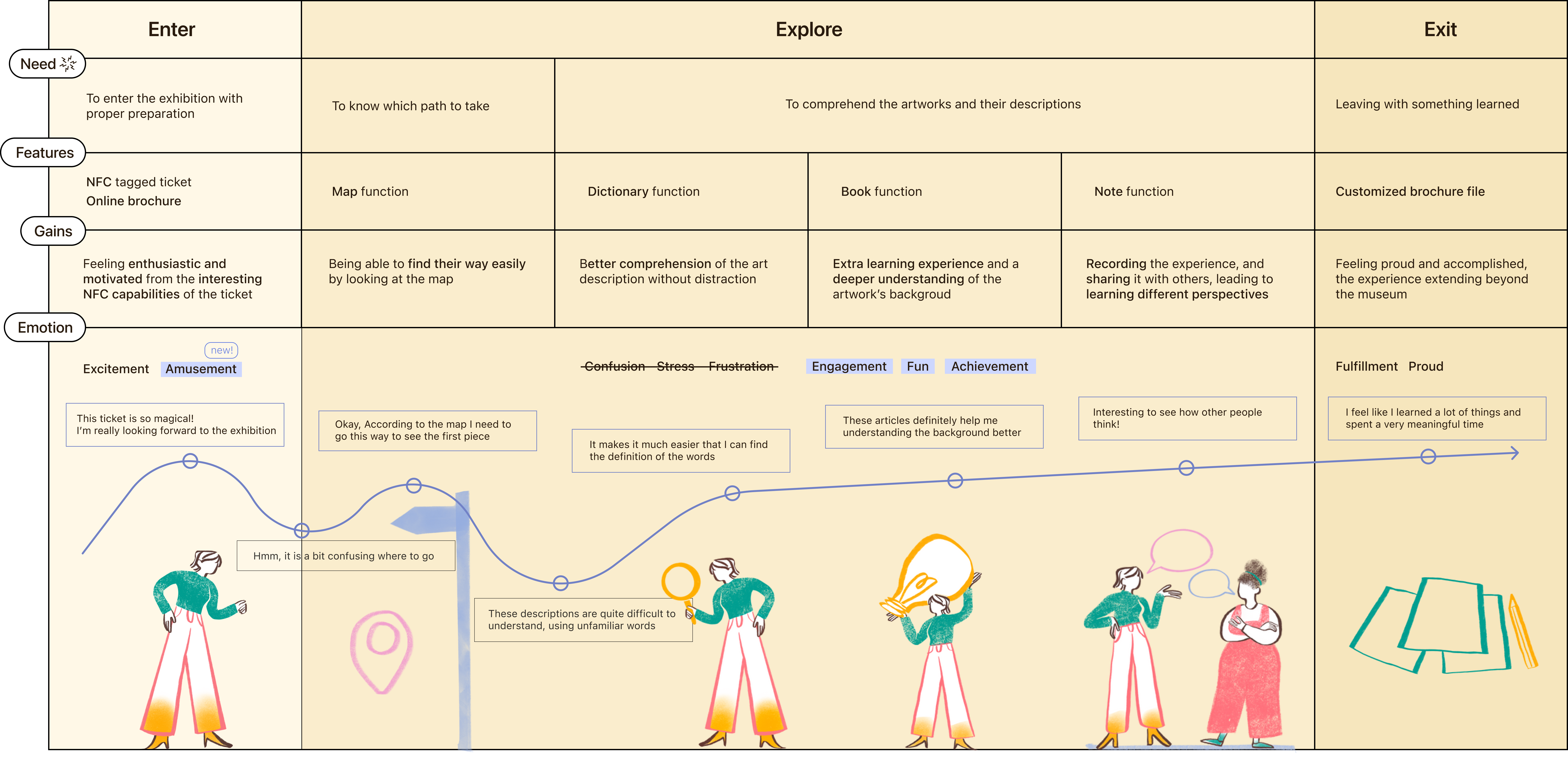
What would users think and feel?
Here is a simple visualization of what users would think and feel while going through the exhibition using a new mobile brochure from the beginnig of the journey to the end.
Final design
Here, I present the final mobile brochure prototypes and will walk through each feature one by one.
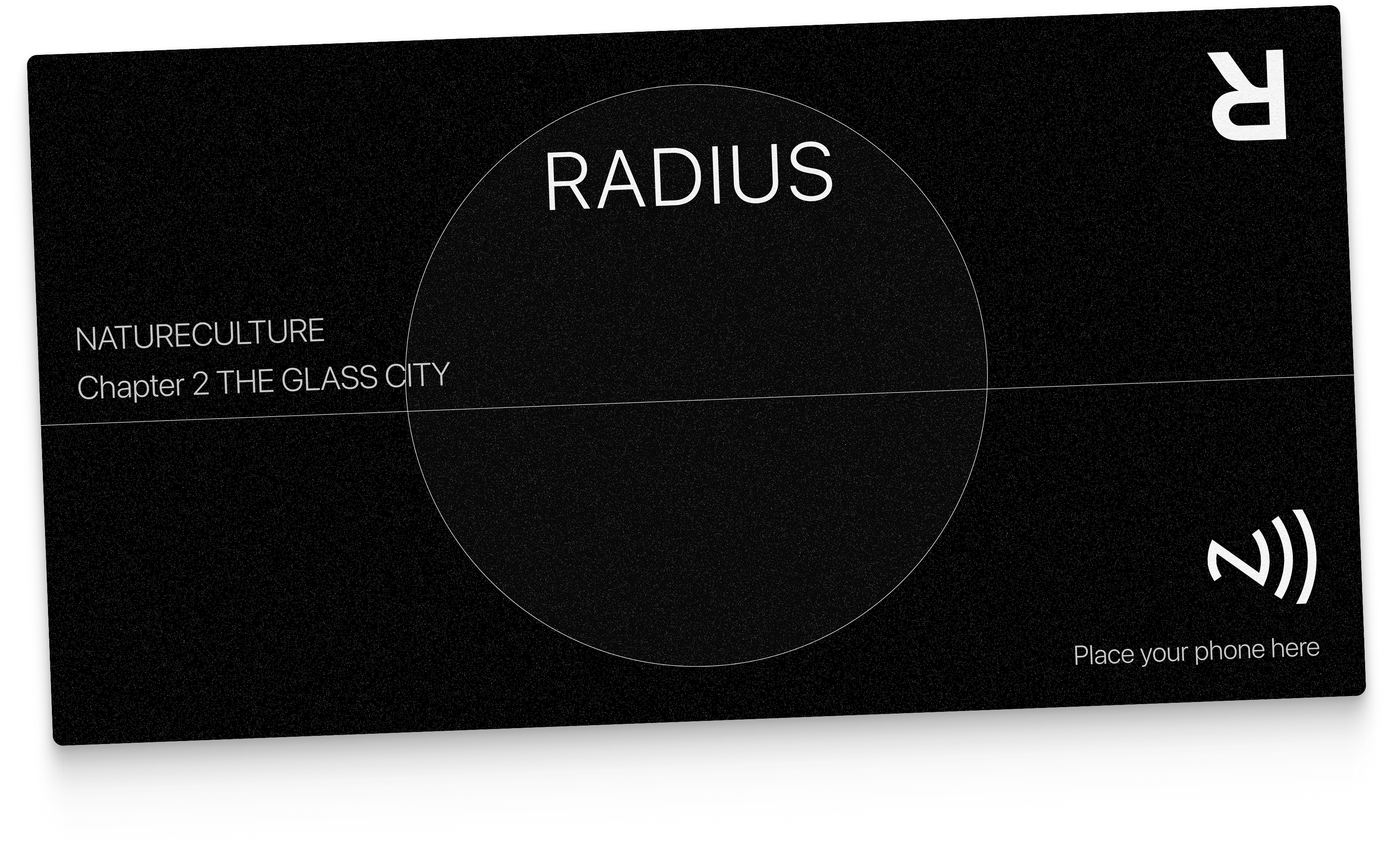
NFC Entrance Ticket
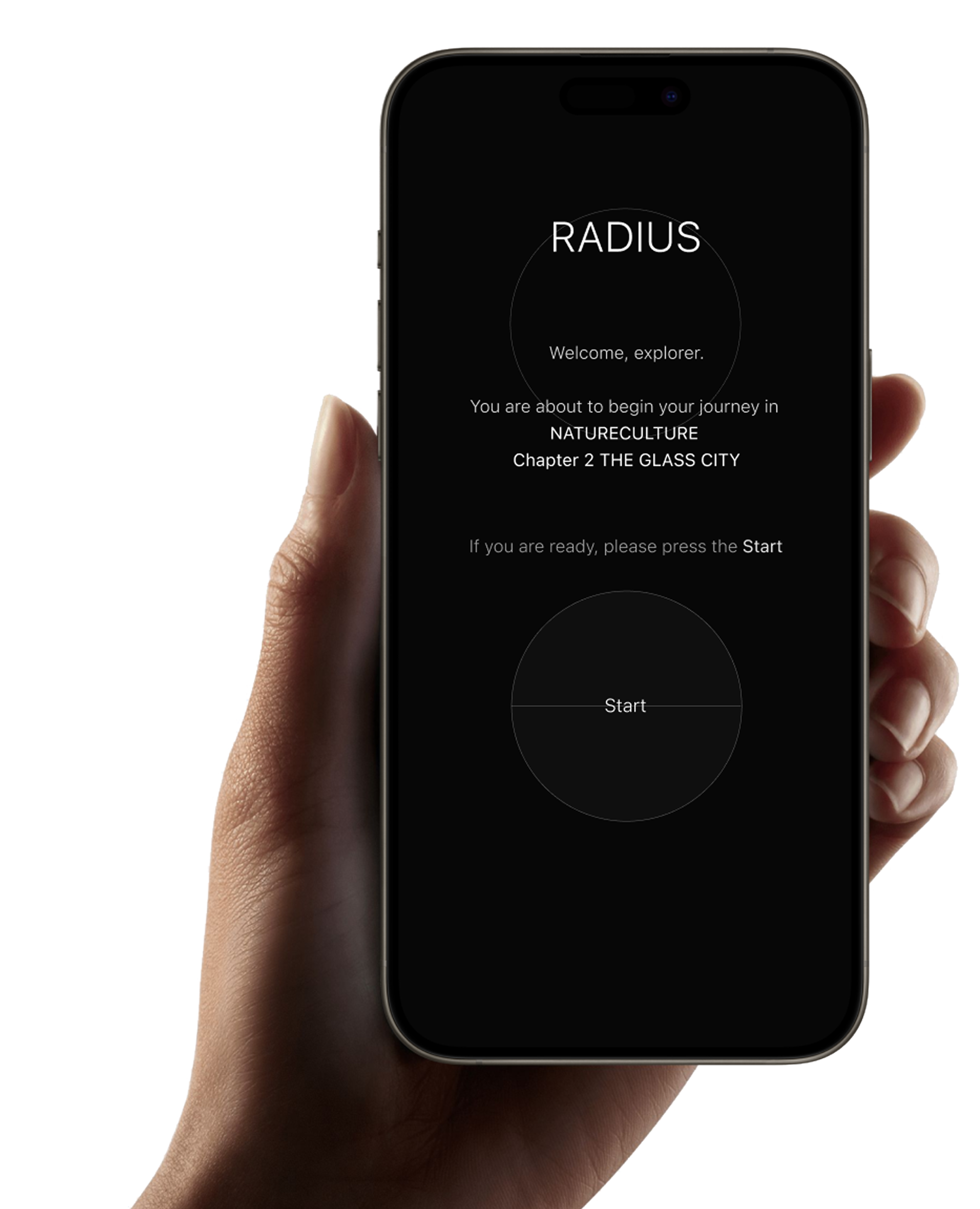
As the first touchpoint, visitors receive an NFC ticket at the counter. With a brief introduction from the staff, they can simply scan it using their phone and are naturally guided to the mobile brochure without friction or hesitation.
Personalized Onboarding
The product first engages visitors by inviting them to choose the name they’d like to be called. Once entered, they’re greeted personally and guided through a short, clear onboarding process introduing first of four items 'map'.
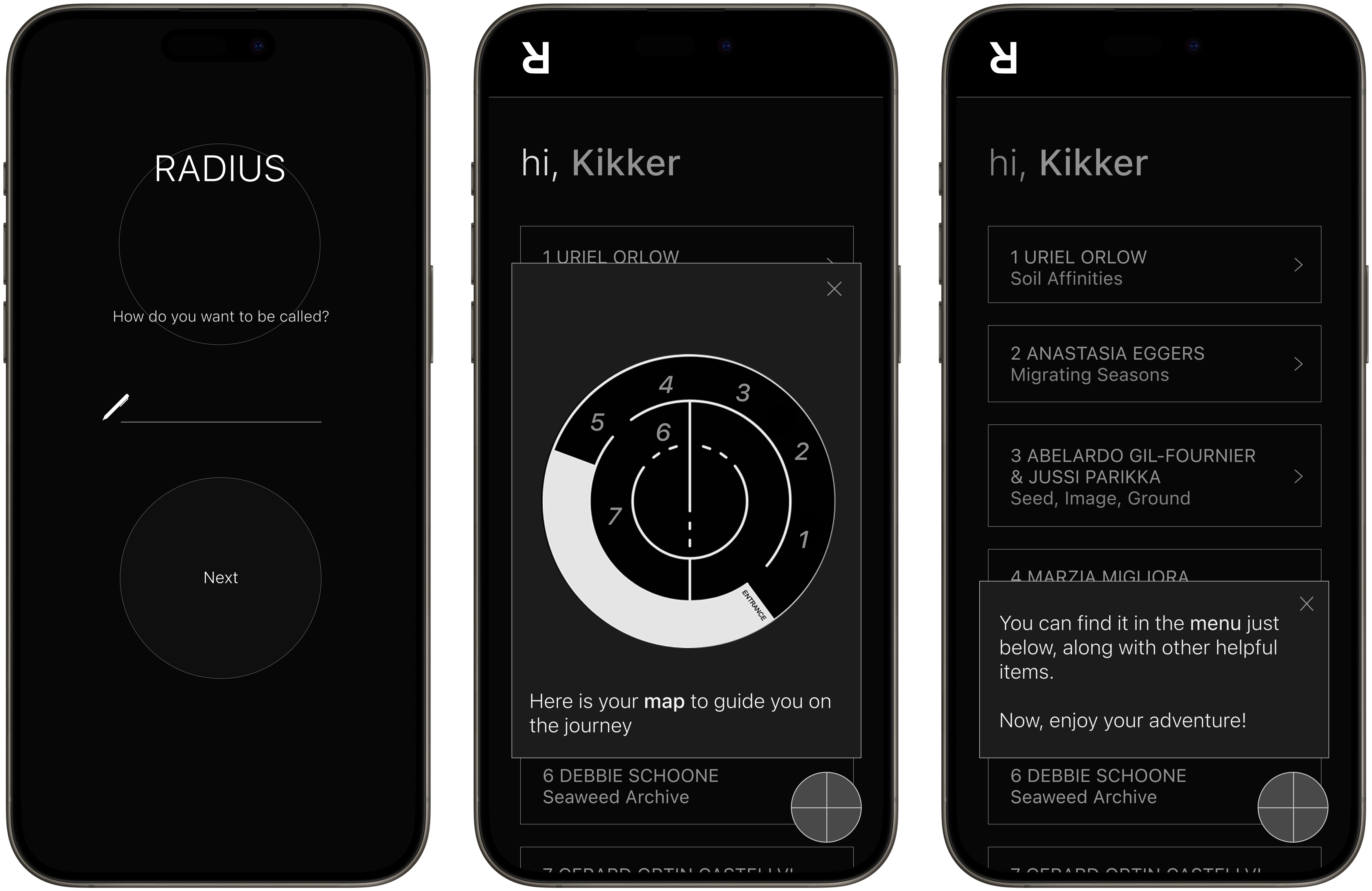
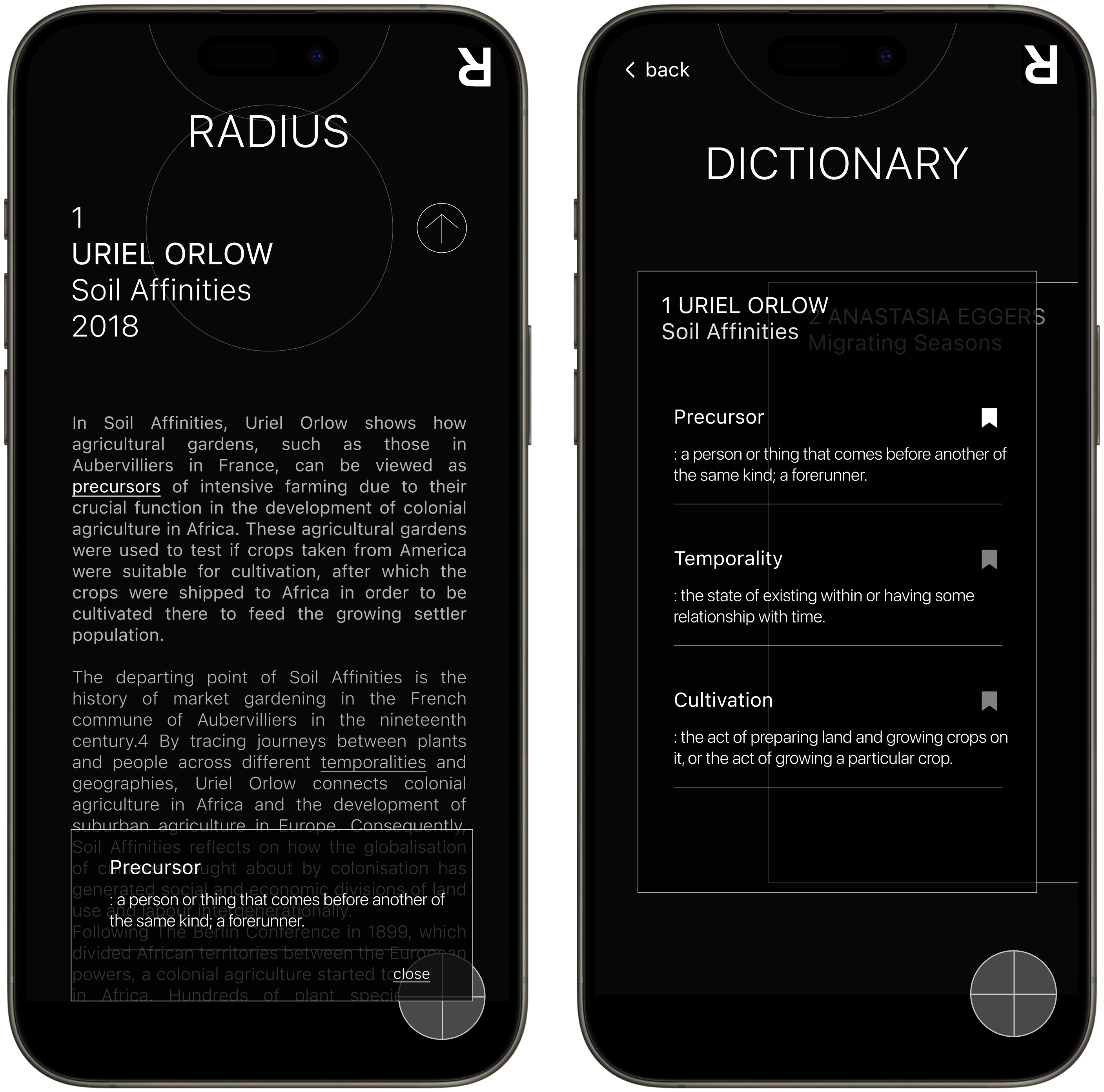
Dictionary
The second items is a “Dictionary,” designed to help visitors navigate difficult jargon. As they read the artist’s explanation, they can simply tap on unfamiliar words to instantly view their meanings.
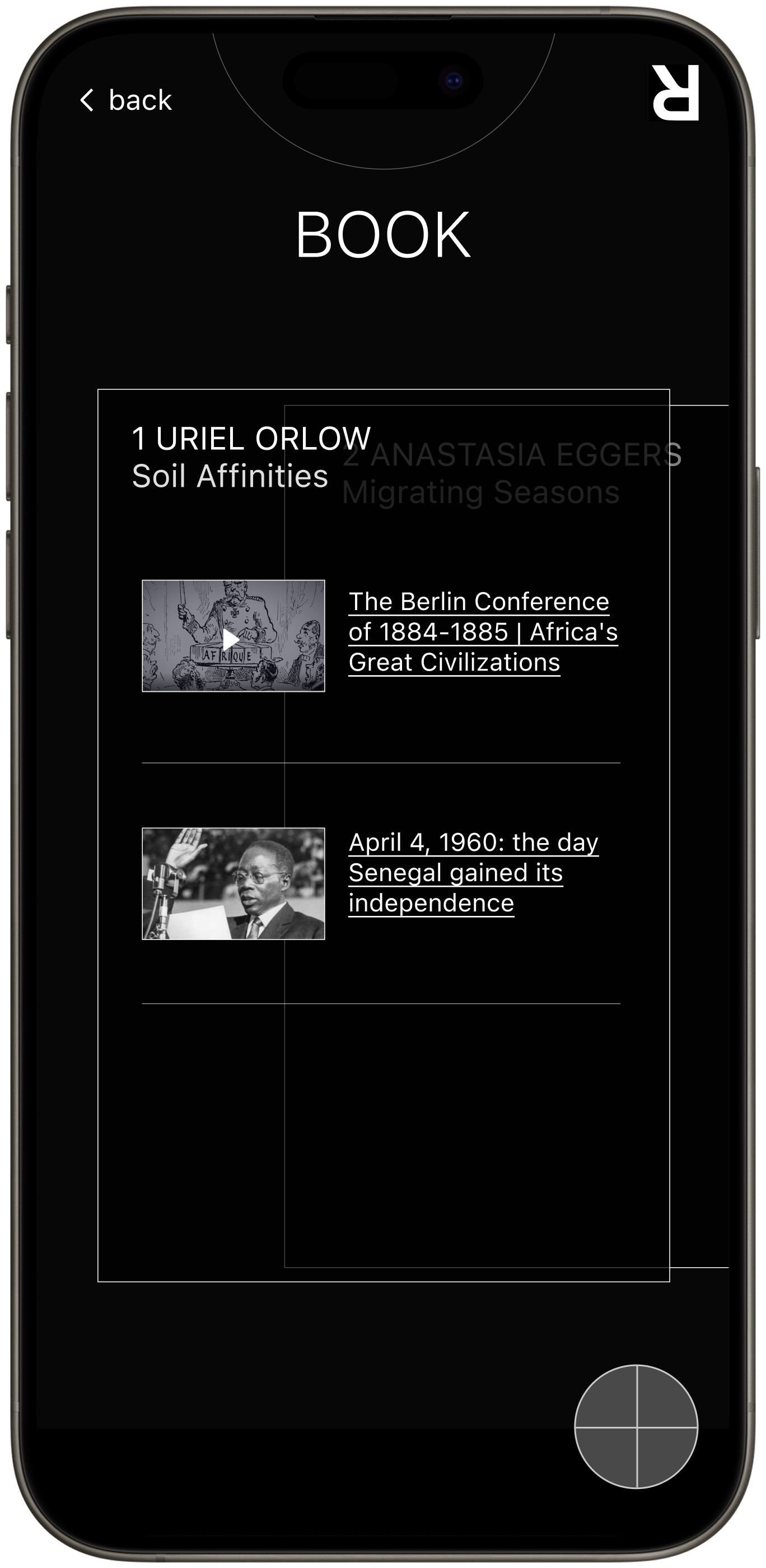
Book
The next feature is a “Book,” designed to support visitors unfamiliar with certain historical events or scientific theories, providing useful resources they can explore and study further.
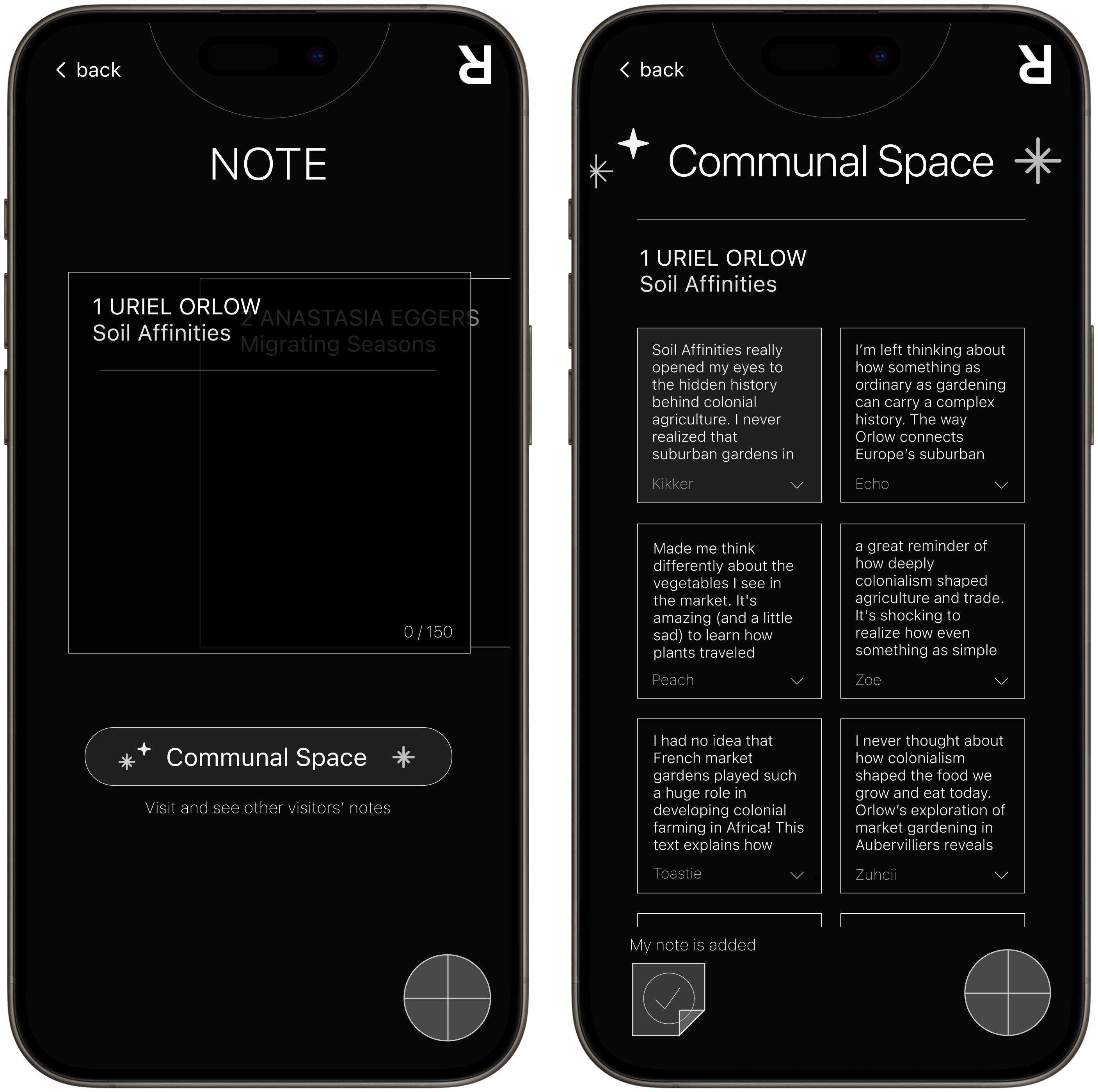
Note and Communal Space
The “Note” item allows visitors to jot down their thoughts and impressions. Research revealed that visitors in groups enjoy sharing their ideas, which enhances the overall experience. The “Communal Space” further supports this by providing a place for visitors to share and discuss their notes.
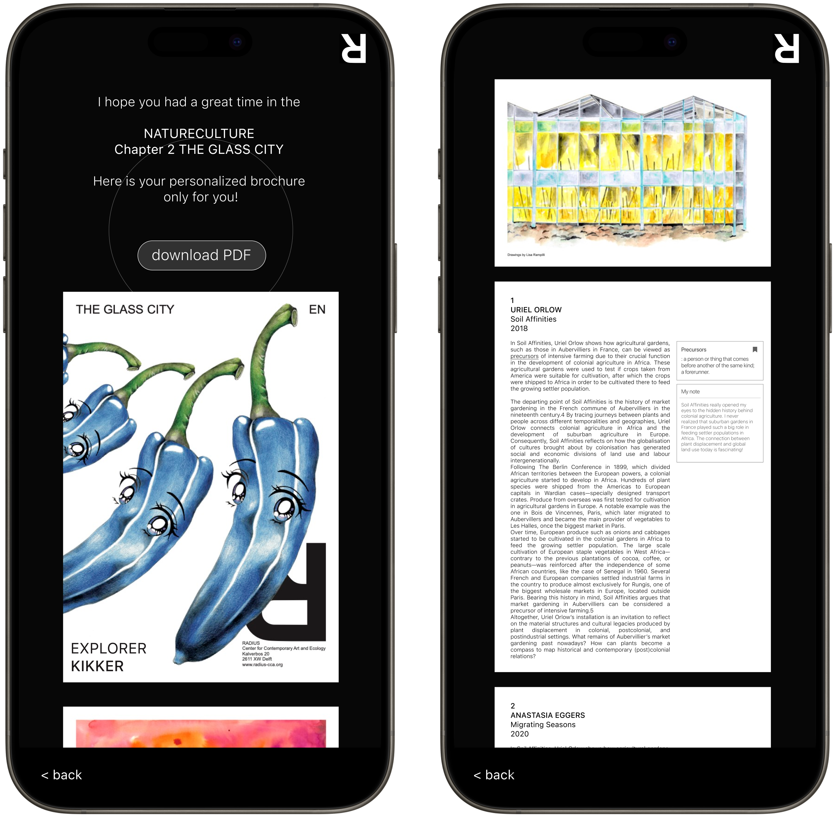
Customized brochure file
Towards the end of their journey, visitors receive a brochure file that captures all their interactions within the mobile brochure, from words they looked up to the notes they left. They can download it as a PDF or even print it out, letting the experience linger a little longer in their memory.
Research Archive
Discovery Research
Methodology
I conducted a qualitative study over a 3-week period to understand the early stage of technical buyer journey for TomTom's documentation website.
- 10 in-depth interviews (60 mins each)
- Participants: 5 Developers, 5 Product Managers
- Location: Online, Europe and UK
- Platform: UserTesting.com
- Structured interview quesions and scenario and task-based usability testing on the existing portal
Key Detailed Metrics
Key Pain Points
"Search bar is prominent; I am surprised this is the first thing they have. I'll skip it for now"
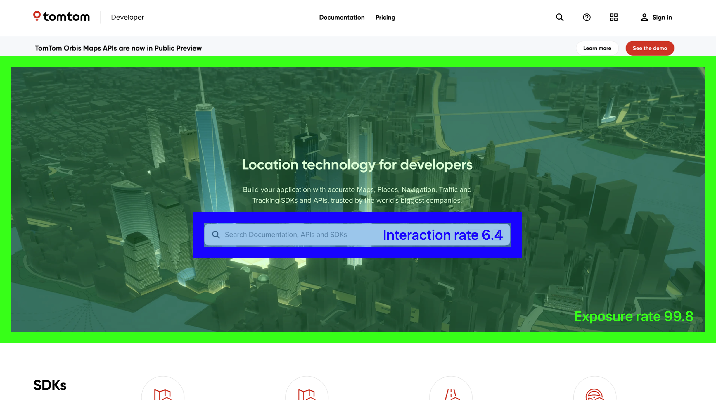
Page analytics indicates that the section was exposed to 99% of the first-time visitors, while only 6% of them clicked on it. It implies that the search bar does not work as a primary tool for a navigation for first time users.
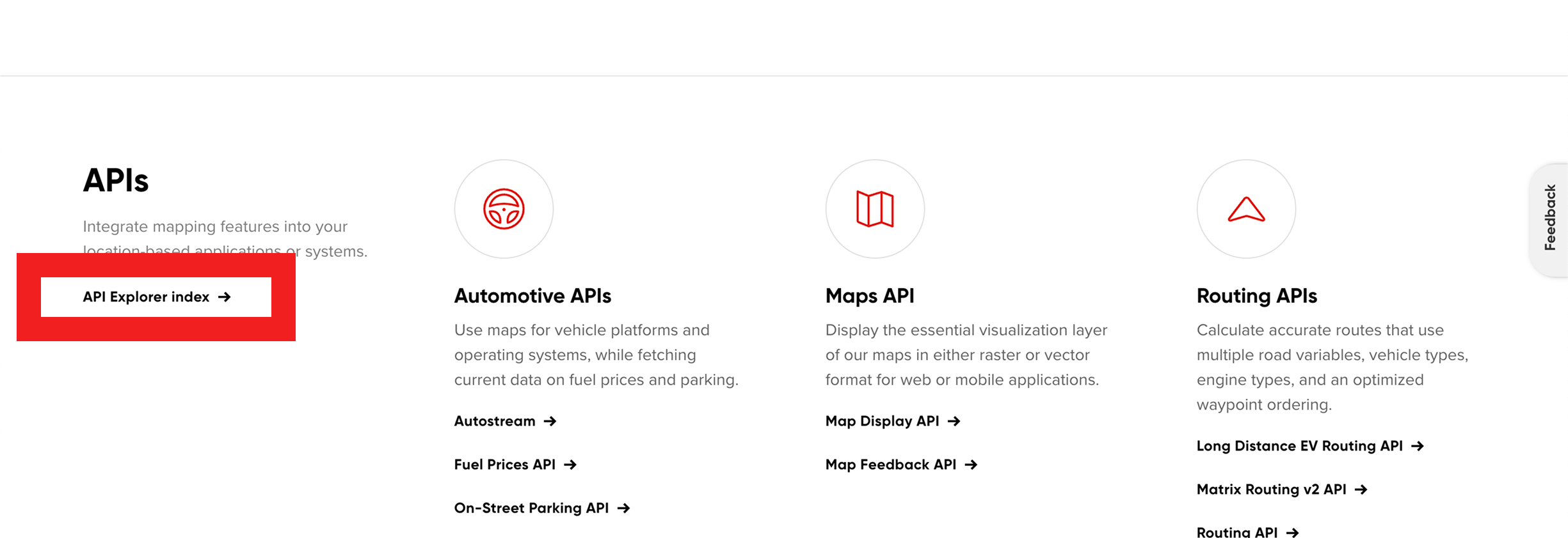
"API Explorer is 'hidden' whereas I would like to see it first."
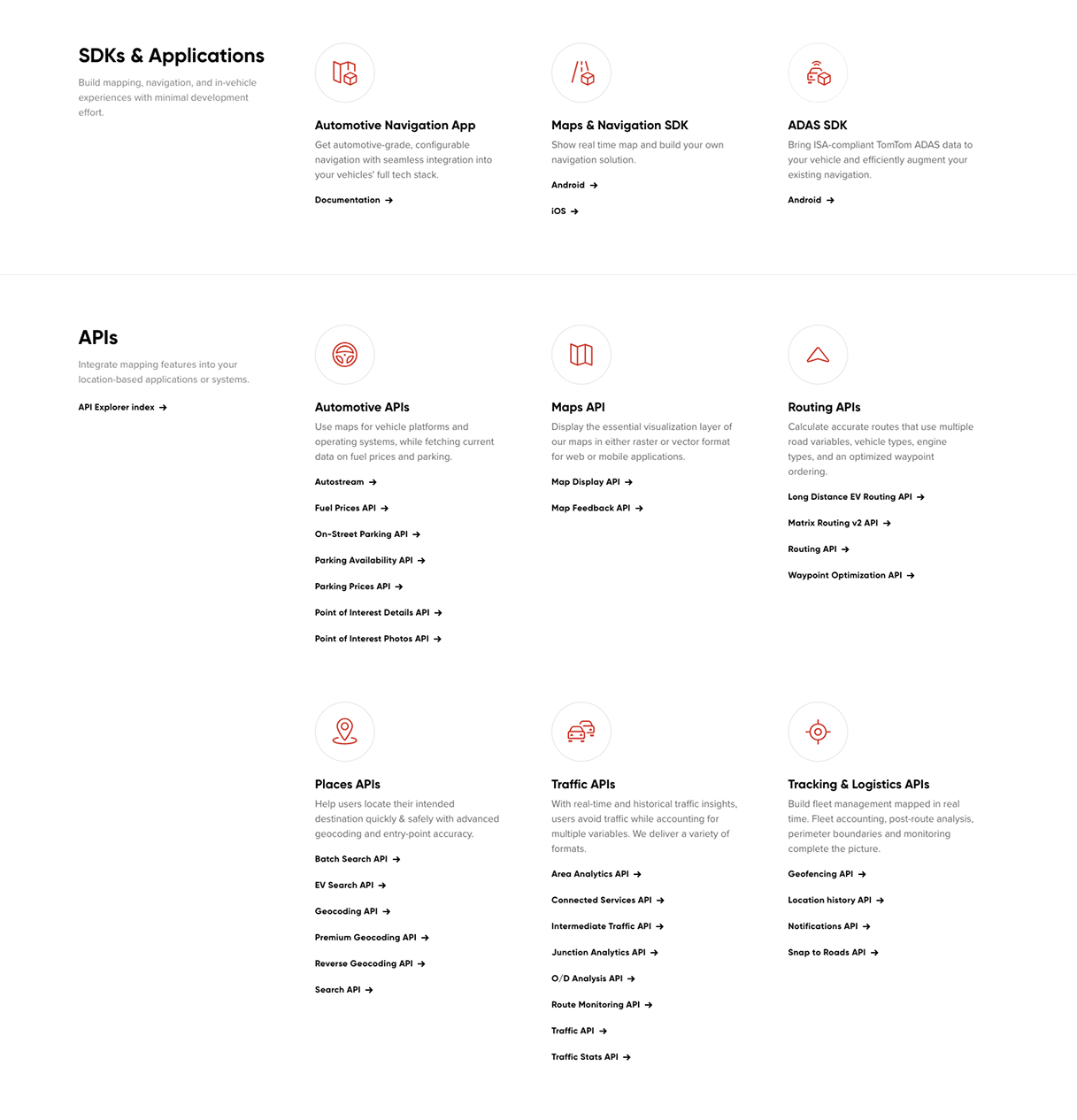
"I think right now, It's a little bit harder to sort of see that connection (between products) right off the bat, because you're almost overwhelmed at this point."
"I think testimonials always adds a little bit more validation, especially if you're trying to convince another team or your own team."
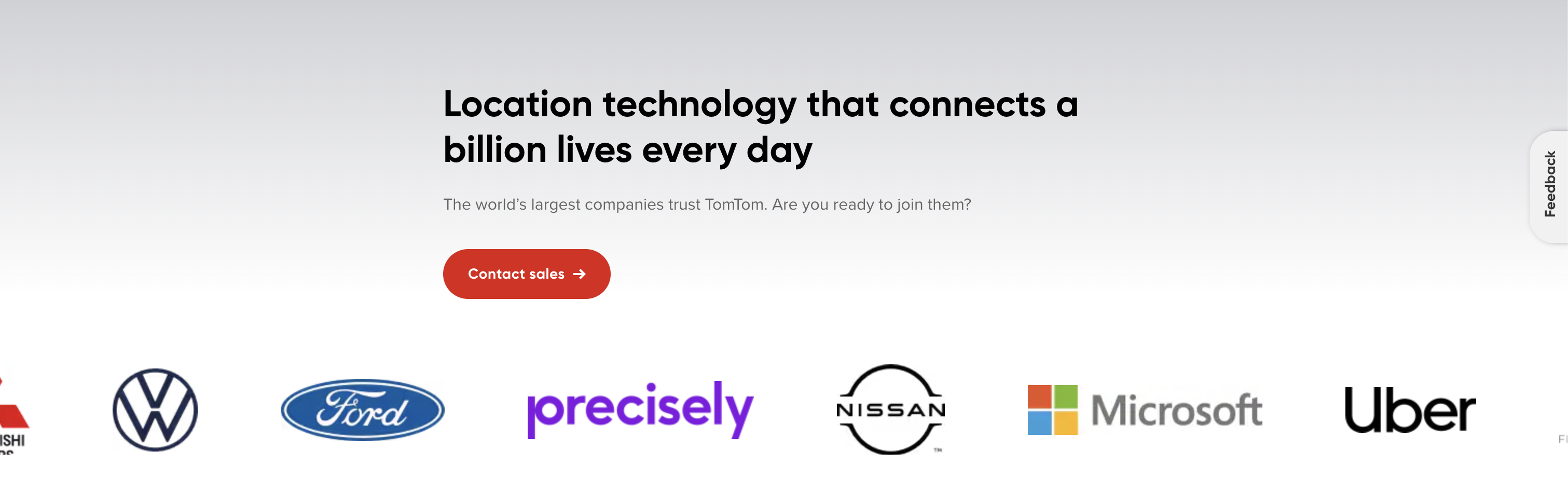
Despite the existence of entry to testimonials (by clicking the company icons), none of the participants noticed.
"It's quite long... it's not ideal, I would rather go to the API explorer to look a bit deeper into it"
Key Target Audience Needs
Contextual Information
Educational Contents
Sandbox
Step-by-step Guides
Confidence
Insightful User Behavior
Keyword Search
Limited Scroll
Artifacts
- FILEResearch Protocol.pdf
- FILEInterview Transcripts.zip
- FILEUser Flow Diagrams.fig
Evaluation Research
Methodology
I conducted a usability test comparing the old and new designs, measuring several qualitative and quantitative metrics.
- 10 unmoderated online testing session (15 questions each)
- Participants: 10 developers or product managers. old design n=5, new design n=5.
- Location: Online, Europe and UK
- Platform: UserTesting.com
- Structured quesions, scenario-based task and rating scales.