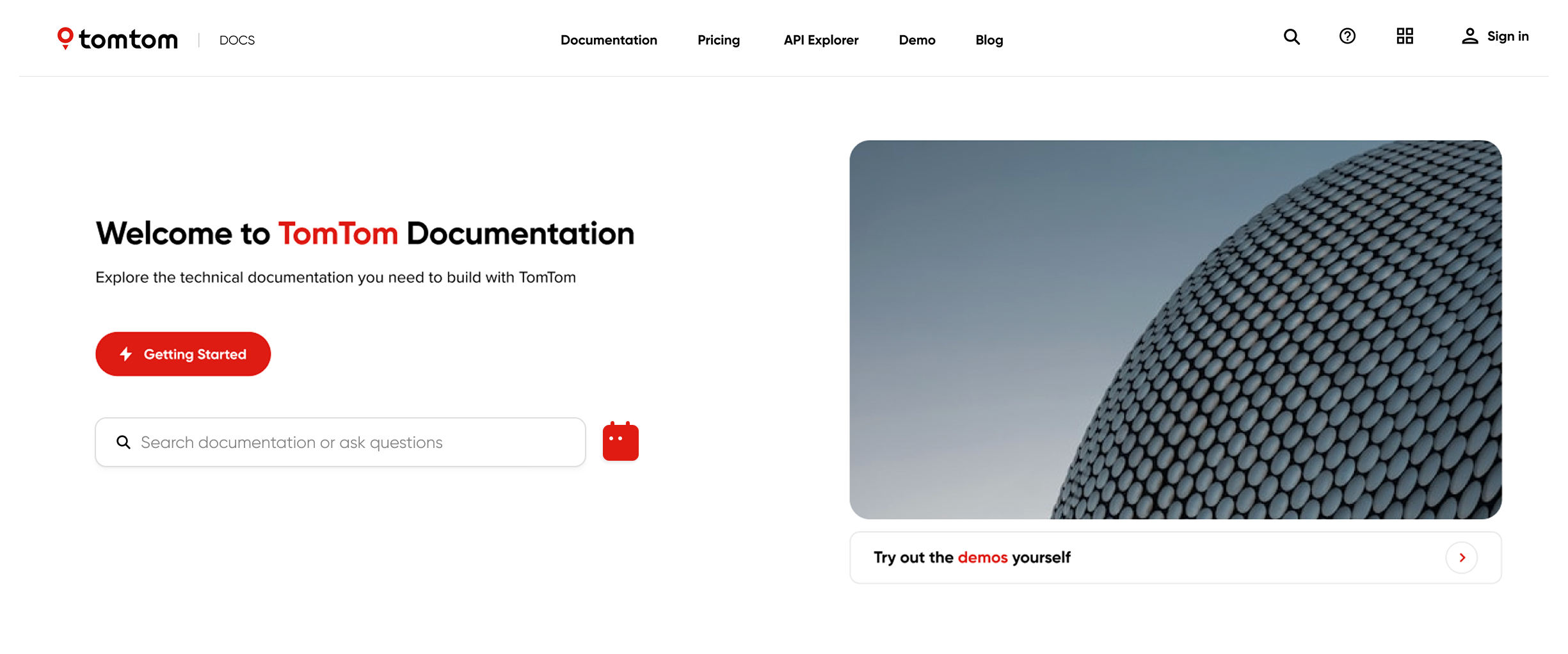
TomTom Developer Portal
Creating an intuitive and guided discovery experience for technical users navigating a complex location technology ecosystem
TomTom, headquartered in Amsterdam, specializes in geolocation software, collaborating with companies such as Uber and Volvo to deliver high-quality mapping and navigation experiences.
As part of its transition to a product-led model, TomTom is focused on enabling customers to independently navigate the full buyer journey, minimizing dependency on manual support across discovery, evaluation, and integration.
& Designer

The stakeholders noticed that the current documentation website is outdated and difficult to navigate due to a large product portfolio. Yet it serves as an important touchpoint for potential new customers, making a strong first impression essential.
Improve the first time experience of potential customers on the developer portal, by making it easy to navigate.
Increased number of new customer acquisitions
Increased positive feedback from potential customers among users
Reduced amount of manual support requests during the discovery and onboarding process
Target Group
The primary target group was potential customers in the decision-making process of purchasing location technology software and considering TomTom as one of their options.
From previous research at TomTom, it was revealed that software developers and product managers were among the main users of the developer portal.
Discovery research
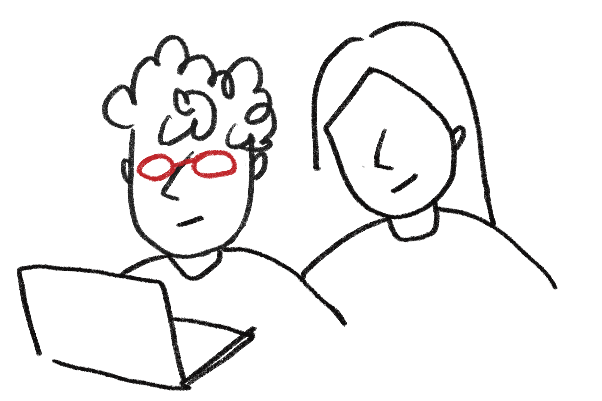
The discovery research included in-depth interviews combined with usability testing with 10 external participants. The goal was to observe and understand their needs and pain points with current website as a first-time visitor focusing on their navigation behavior and attitude.
Key findings on how users struggle
Below are four key insights extracted from the research. For more information, please check out the

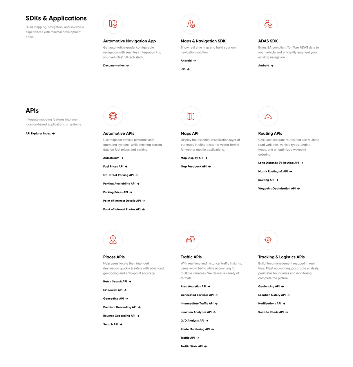
The current documentation site does not answer the key question first-time visitors have: Which products do I need to solve my problem? While users are presented with a wide range of product offerings, the connections between them are unclear. As a result, users struggle to narrow their focus to a relevant set of products and can easily feel overwhelmed or lost.

First-time visitors perceive current docs website as a high-level glossary of product specifications for those who are already familiar with TomTom products. At this stage in their journey, they want to get a clearer sense of what the products are and how they fit together, rather than jumping straight into detailed how-to usage guidance.

Heavy use of industry-specific jargon further increases the difficulty for those who are not familiar with geolocation technologies. Users specifically noted the absence or low discoverability of resources such as starter guides, demos, and blog, which negatively impacts their ability to get oriented.

Technical users strongly prefer learning by doing. Long blocks of text in the documentation require too much time and effort; they would rather dive in, experiment with code, explore product functionalities, and see firsthand what the outcomes would look like.
Research conclusion
Having a technical background does not necessarily mean users understand which tech stack or documentation they need. Location technology is complex, even for those with relevant experience. Many users come to explore products, identify the right components to build their solution, and learn along the way. However, they often struggle due to overwhelming product lists, heavy use of jargon, and poor discoverability of essential content.
Design goal
Design an intuitive and guided discovery experience that helps users confidently and efficiently explore, identify and learn the right products, documentation, and relevant content without being overwhelmed by complexity or jargon.


Ideation
While ideating design solutions, I focused on addressing the key insights from the research while also considering the existing users and those at different stages of their journey.
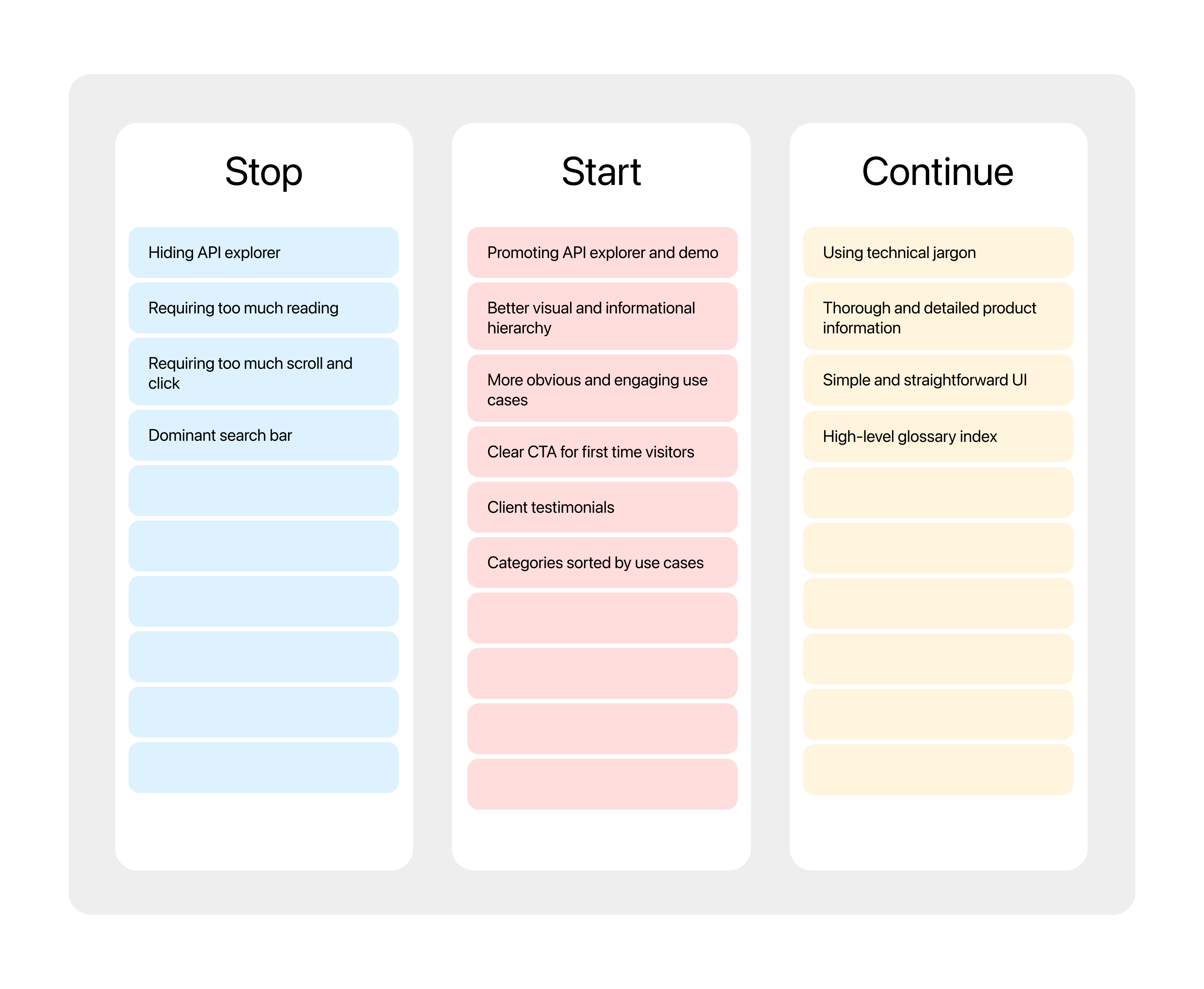
Step 1: Stop, Start and continue I chose this method as I was redesigning an existing platform rather than creating a new one, and there are existing users whose needs must be considered. This approach helped me organize and visualize the existing constraints and opportunities at the same time.
Step 2 and 3: Brainstorming and Dot voting After Step 1, I held separate brainstorming sessions with two developers and the design team to gather insights from both users and internal experts. I then used dot-voting with the design team to prioritize ideas and define the next direction.
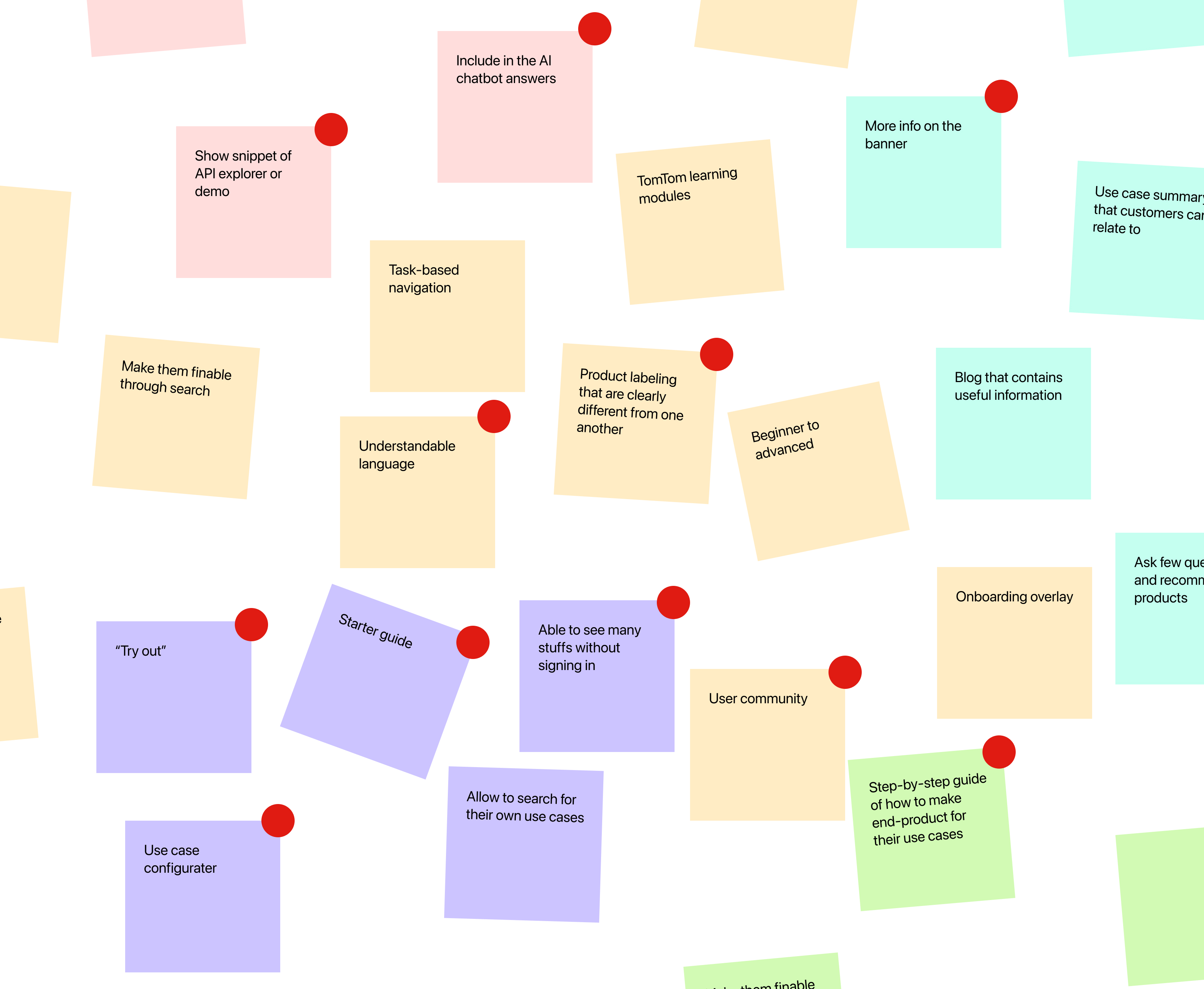
Step 4: Wireframing Based on the design direction defined in the previous steps, I began wireframing. The designs were continuously iterated through stakeholder feedback, design critique sessions, and user testing.
Key design solutions
Below are four key design solutions that can help users fullfill their needs and properly overcome the initial struggles.
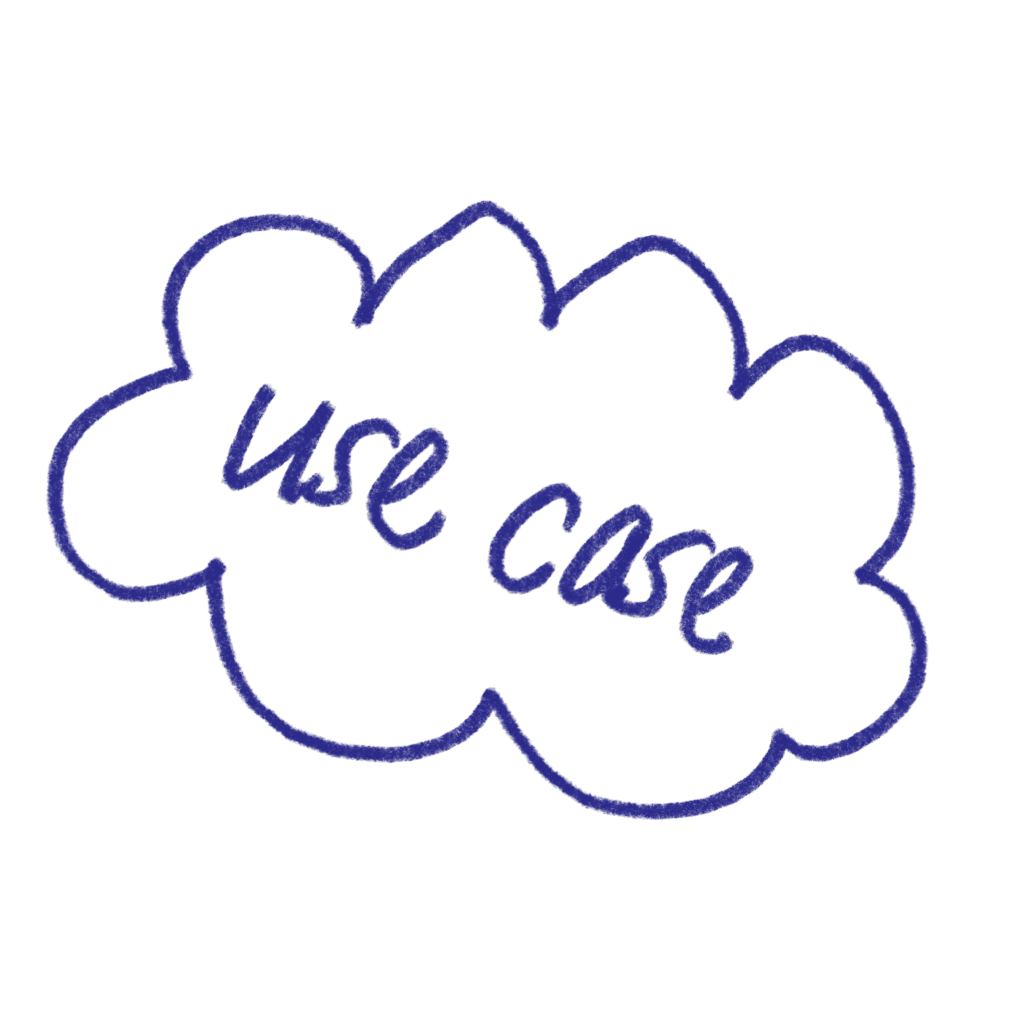
Use case-led approach
Users don't come to the site thinking about specific products. They're looking for a use case that matches their goal.
By leading with use cases instead of products, we can offer a first layer of filtered, relevant options. This helps reduce cognitive overload and makes it easier for them to focus only on what actually matters for their solution.
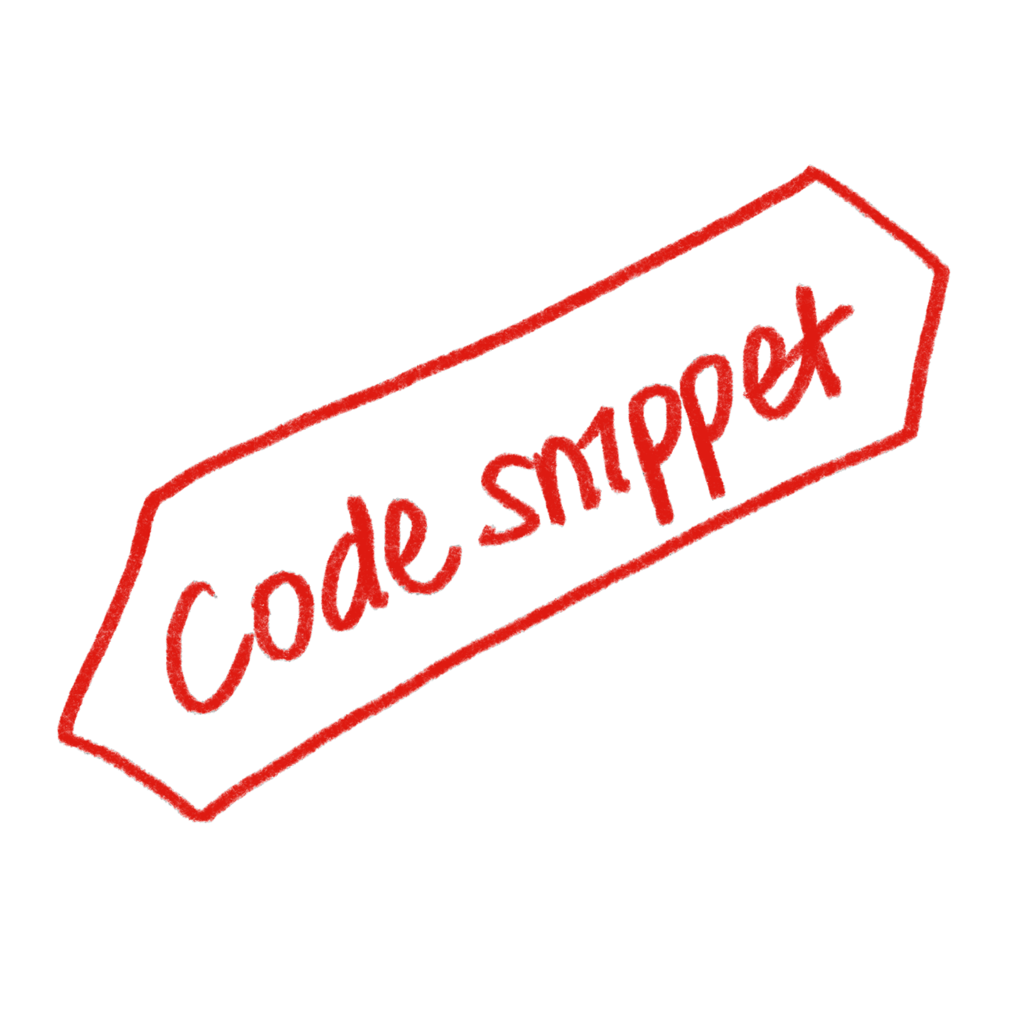
Interactive snippets
Users prefer learning by doing. They want to actively engage with a feature rather than read through plain text and imagine the outcome.
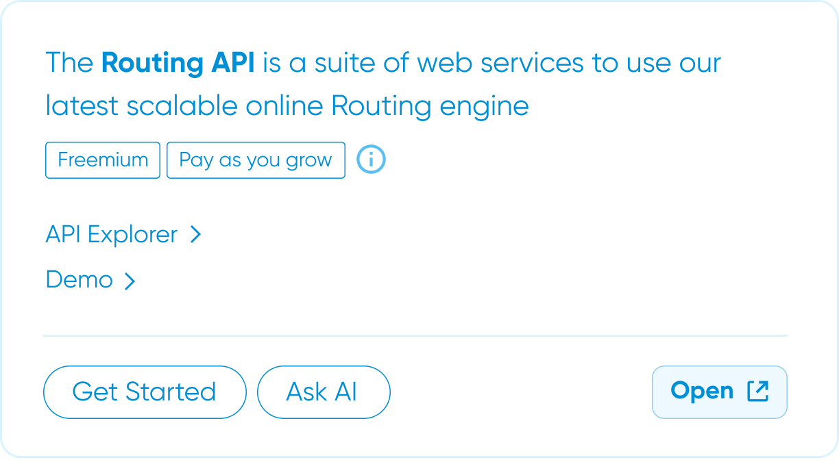
By creating simple interactive snippets of features like an API explorer or a live demo, we can showcase product capabilities in a much more tangible way. This not only helps users understand value faster, but also allows us to communicate the product's potential more efficiently.
Optimized content location
Some users independently pointed out that certain content felt missing or hidden, even without being prompted about it. That signals a real gap in the experience.
There's an opportunity to proactively surface this content, by placing it where users naturally expect to find it. By aligning content visibility with user intent and progression, we can reduce friction and create a smoother, more predictable experience.
Fostered AI search experience
An AI assistant has the potential to be one of the most efficient ways to answer the wide range of questions our target users have. It can guide, clarify, and even recommend relevant products in context. However, many users hesitate to use it.
There are trust, usability, and expectation barriers that prevent adoption. By identifying and addressing these blockers, we can strengthen confidence in the feature and significantly enhance the overall journey
Before and after
Here is a simple visualization of what users think and feel while going through the pain points and how it would change with the new design solutions. Click each card to compare what the user journey is like before and after!

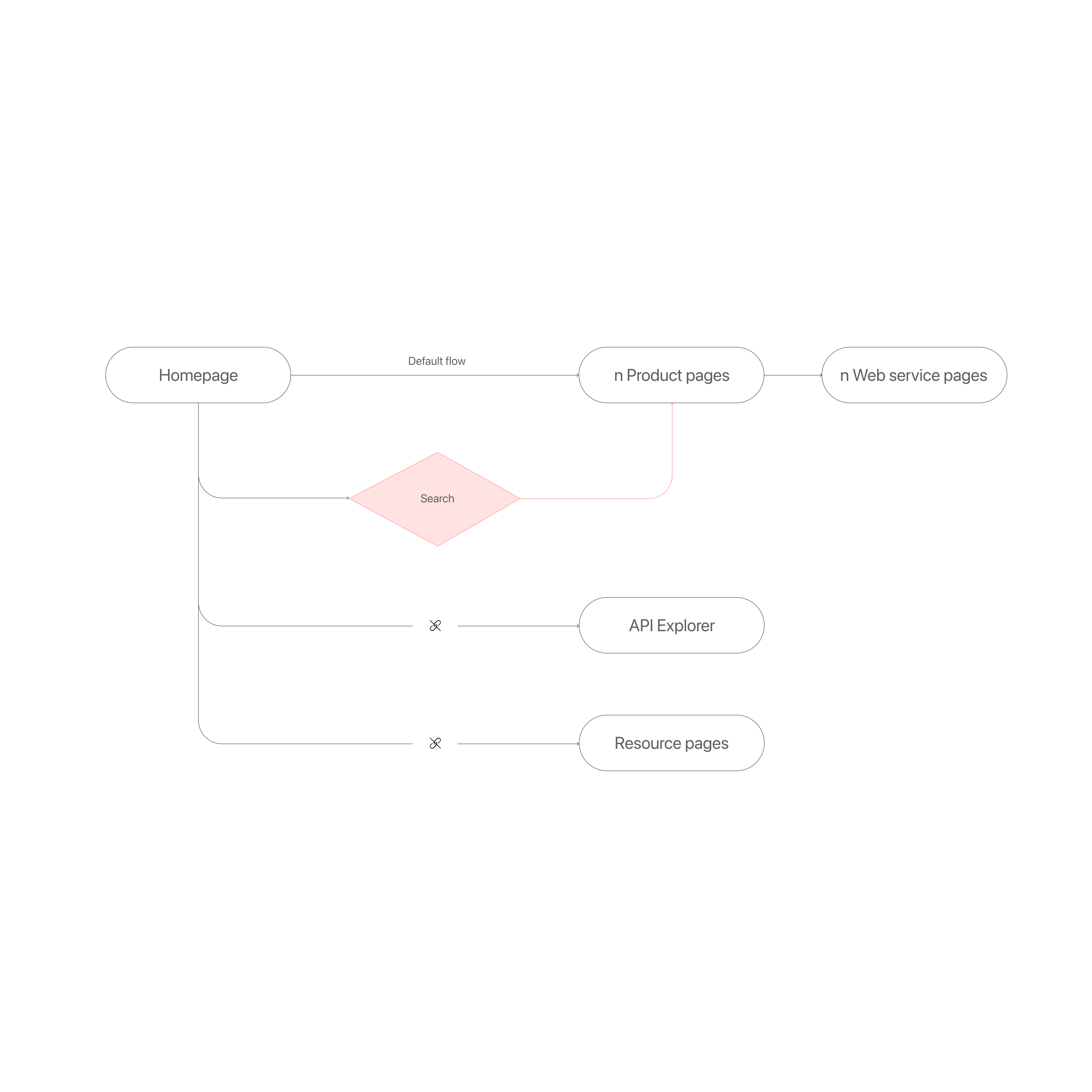
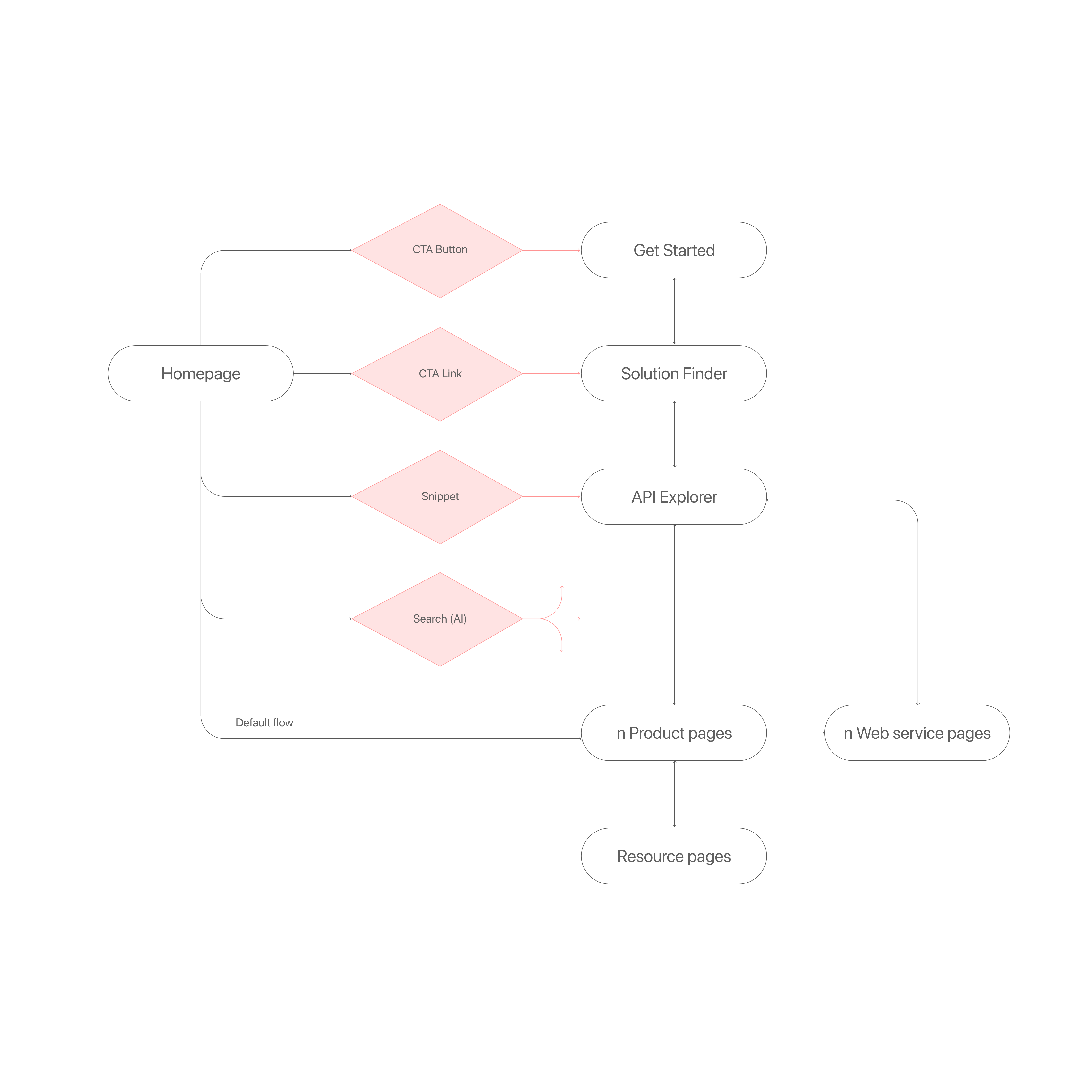
Flow Chart
Current flow is only allowing a linear flow as an option for users, making them go through every single pages to get to the information they need.
New flow would provide users more flexible and multi-entry exploration allowing them to find what they want at any stage of the journey.
Homepage as a central hub for the navigation
As a result of aligning on design direction, the team and I identified the homepage as the most crucial and urgent touchpoint to improve and test. It went through multiple iterations based on testing and feedback, and below are the final designs for each section.
A new nav bar allowing quickly discover and access to key resources pages.
An interactive demo snippet adding dynamic visual interest and increasing discoverability.
The animated new AI chatbot, “Tommy,” naturally drawing attention and encouraging users to try it out.
An updated product section helping visitors quickly understand use cases by product group through clear mockups of final outputs.
Concise descriptions reducing heavy jargon and improve clarity.
Flexible viewing options catering to different preferences, minimizing overwhelm from long product lists and excessive scrolling.
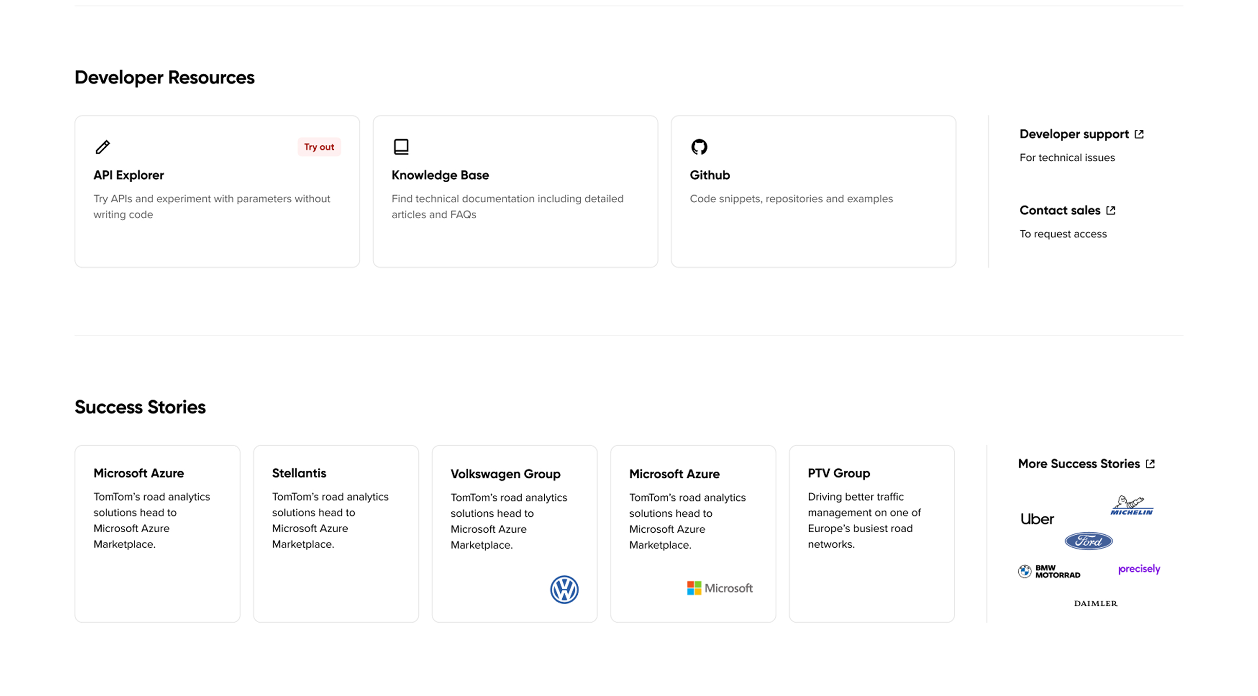
The bottom section enabling users to discover additional content and resources to further explore the products.
Clearly presented success story cards and direct access to the API Explorer.
Does new design actually work?
In the final testing session, I focused on validating that the new homepage design actually addressed the pain points we'd uncovered in the discovery research. I approached this by setting up success criteria aligned with the key metrics we had tracked earlier and then comparing the results.
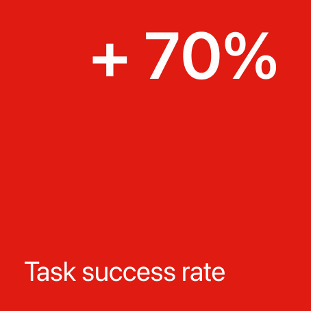
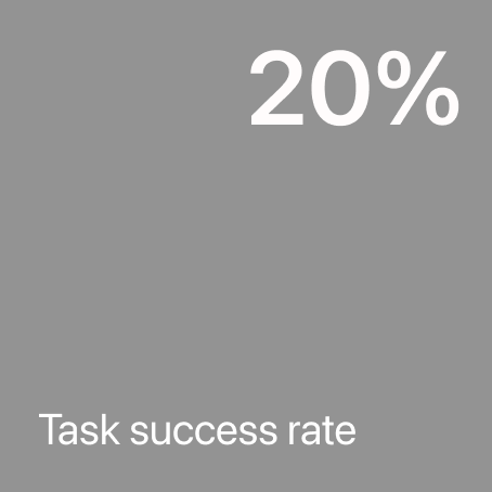
Wheares only 2 out of 10 participants were able to complete the task of locating specific links or content, 8 out of 10 were able to do so with the new design.
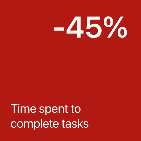
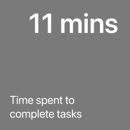
The time required to complete all tasks decreased from 11 minutes to 6 minutes, showing a significant improvement.
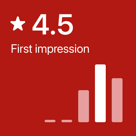
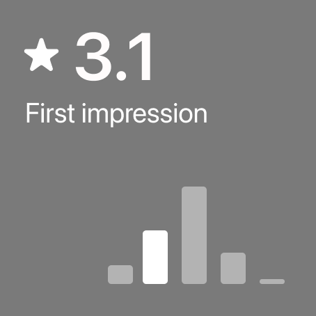
The Likert scale rating (1 = highly negative, 5 = highly positive) measured participants' first impression on the site. It also increased, with an average score of 4.7.
The rating question (1 = very difficult to find, 5 = very easy to find) measured how easily users felt they could locate information while completing tasks. The average score highly improved from 1.8 to 4.7.
Concepts like the Get Started page, Solution Finder, and AI search assistant were tested through visible CTAs such as buttons and links. Even in this lightweight form, they sparked the intended reactions such as curiosity, a sense of liveliness, and a more welcoming experience for first-time users.
Things for the future
Although the relevant CTAs was validated in final testing and showed strong potential, the page designs weren't included in the testing or MVP due to bandwidth constraints at scale. Encouraged by the team, I continued developing them into full high-fidelity prototypes and shared them as visionary proposals.
Get Started Page
Users feel lost and often have difficulty orienting themselves when they first land on the documentation homepage due to the lack of a clear starting point.
The Get Started page provides a guided experience with curated starter resources, helping users quickly understand product offerings and feel confident in their first steps.
Solution Finder
During the discovery phase, users come to the site with a specific problem to solve, not with predefined products in mind.
The Solution Finder is a dedicated tool that helps first-time users quickly understand the available products, what they can build with them, what to expect, and what is required, by presenting this information through preselected popular use cases.
Smart Discovery Assistant, Tommy
First-time users have many questions, and finding answers by reading through documentation takes significant time and effort. The existing search and AI chatbot see low adoption and provide limited support during early exploration.
A search experience with an integrated AI assistant creates a seamless early-learning journey. By surfacing preselected, well-timed prompts, it sparks curiosity and helps users ask the right questions at the right moment, making exploration intuitive and engaging.
Wrapping up
Based on the final testing and a few more discussions with stakeholders, the MVP design was createdThen I supported the development team during implementation by adjusting the UI to better align with the existing component library.
What I learned from working at a large tech corporate
Platform ecosystems are trickier than they seem! : When working on a single product that's part of a bigger system, it really helps to have a point of contact for each platform and some key metrics to see how everything connects and affects the project.
Legacy matters. Especially on platforms like developer portals or documentation sites. Some areas may be out of UX's reach, often becoming outdated or overlooked. Even so, it's important to address these issues and be proactive about speaking up.
What I learned from working with mature UX team and various stakeholders
It's important to pitch ideas clearly, but also adapt them depending on the audience. Some people want to hear how the solution helps users, others care about how it makes the business stand out. The key is to be prepared and flexible, and make the case from all angles.
Always be ready for the "why" questions. Why is this change important? How does it really help users? Implementation taks time and resources, so the team needs to be convinced that the update will create a real impact and tangible value.
Research Archive
Discovery Research
Methodology
I conducted a qualitative study over a 3-week period to understand the early stage of technical buyer journey for TomTom's documentation website.
- 10 in-depth interviews (60 mins each)
- Participants: 5 Developers, 5 Product Managers
- Location: Online, Europe and UK
- Platform: UserTesting.com
- Structured interview quesions and scenario and task-based usability testing on the existing portal
Key Detailed Metrics
Key Pain Points
"Search bar is prominent; I am surprised this is the first thing they have. I'll skip it for now"
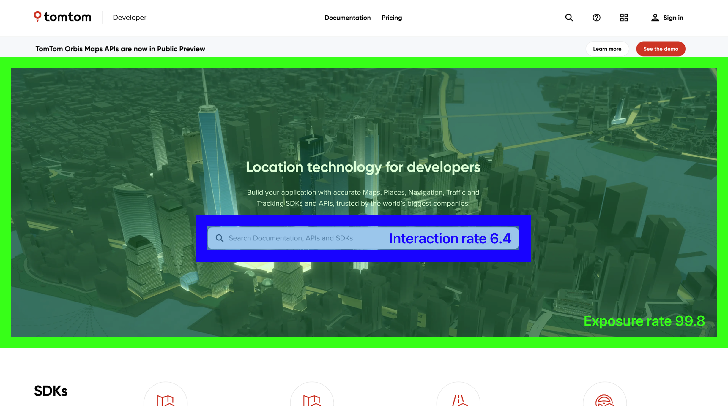
Page analytics indicates that the section was exposed to 99% of the first-time visitors, while only 6% of them clicked on it. It implies that the search bar does not work as a primary tool for a navigation for first time users.
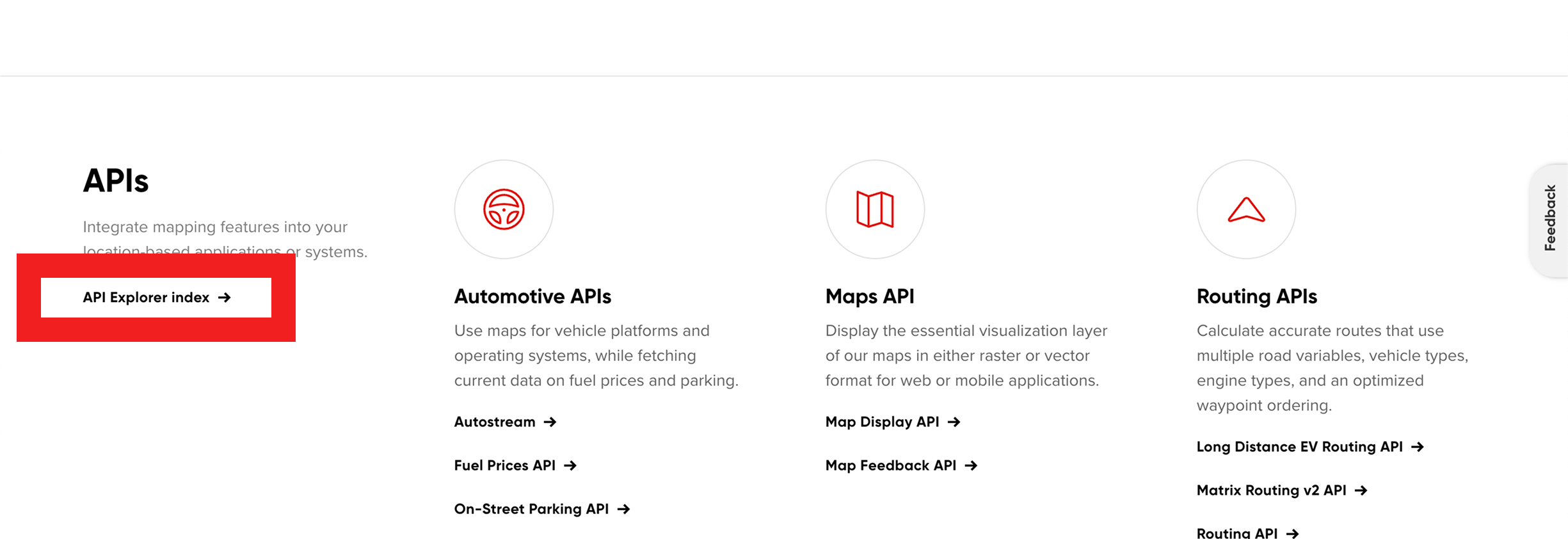
"API Explorer is 'hidden' whereas I would like to see it first."
"I think right now, It's a little bit harder to sort of see that connection (between products) right off the bat, because you're almost overwhelmed at this point."
"I think testimonials always adds a little bit more validation, especially if you're trying to convince another team or your own team."
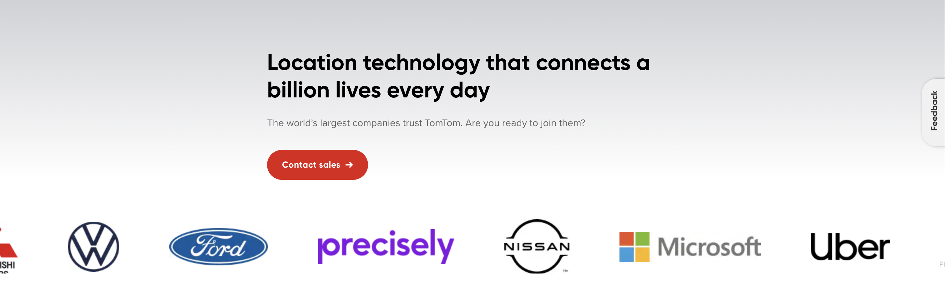
Despite the existence of entry to testimonials (by clicking the company icons), none of the participants noticed.
"It's quite long... it's not ideal, I would rather go to the API explorer to look a bit deeper into it"
Key Target Audience Needs
Contextual Information
Educational Contents
Sandbox
Step-by-step Guides
Confidence
Insightful User Behavior
Keyword Search
Limited Scroll
Artifacts
- FILEResearch Protocol.pdf
- FILEInterview Transcripts.zip
- FILEUser Flow Diagrams.fig
Evaluation Research
Methodology
I conducted a usability test comparing the old and new designs, measuring several qualitative and quantitative metrics.
- 10 unmoderated online testing session (15 questions each)
- Participants: 10 developers or product managers. old design n=5, new design n=5.
- Location: Online, Europe and UK
- Platform: UserTesting.com
- Structured quesions, scenario-based task and rating scales.